TL;DR
A pilot study to incorporate Gemini in public transit.
Research
Through 16 surveys and 5 interviews, I found that subways had the highest user touchpoint and there was a need to align route details with user expectations and preferences.
Design
(1) Utilize the existing Timeline feature to enable users to discover and link transit history with Gemini.
(2) Adapt conversational Gemini for subway service alerts.
Overview

With Google's heavy focus on AI and Gemini (genAI chatbot developed by Google in response to ChatGPT) during the Google I/O 24 event (source), I wanted to see how it could be further incorporated into Google Maps. For example, public transit route options often change depending on the travel time and day. I believe that one potential use of Gemini could be to provide conversational information to users to bridge the lack of routing transparency.
Although this pilot study was conducted independently, I consulted employees from Google for feedback and guidance.
Product Analysis
I scoped the study within the NYC metropolitan area as NYC's public transit includes multi-modal transit options (subway, ferry, tram, bus, and bike). Lessons learnt could be extrapolated to other cities with varying public transit complexities.
I chose to focus on 3 heuristics (usability, understandable, honesty) that I believe make the biggest difference for this user flow.

Key Takeaways
Usability
🟢 There were no significant blockers when routing.
🟢 The use of color created clarity in a sea of map markers.
Understandable
🔴 The dropdown options were mistook for viewing onboard conditions instead of providing feedback.
Honesty
🔴 Train frequencies were mismatched from actual estimates shown on the station platform and actual train arrival time.
Goals + Metrics
Goals
Carry out exploratory research to identify features that incorporate Gemini to:
- Address route transparency for users
- Improve user satisfaction.
Metrics
- Increase in user satisfaction, measured via After-Scenario Questionnaire (ASQ) and Net Promoter Score (NPS)
- Increase in user trust, measured via Trust of Automated Systems Test (TOAST) (source)
- Positive user experiences, observed via qualitative findings

Market Research
Incorporation of Gemini in Google Maps
In Oct 2024, Google introduced the first Gemini features into Google Maps (source). For public transit, users can now use natural language to ask Google Maps for suggestions on places of interest and to answer questions on the place. However, features that tie Gemini with public transit routing have yet to be implemented.

Navigation App Market
Google Maps is used by 70% of monthly navigation and map app users, with Apple Maps coming in second (source). I focused competitor research on the main navigation apps that service NYC: Transit, Citymapper and MTA, focusing on usability, understandable, honesty.

Key Takeaways
Usability
● Apple Maps provides a verified guides and user created guides to help users find and know more about places of interest.
Understandable
● MTA provides clear system status on subway services, making updates look more reliable.
Honesty
● Transit provides numerical estimates for arrival time predictions.
● Citymapper indicates and explains unavailable routes.
User Research
The main goals were to identify:
- What is the role of Google Maps for people navigating public transit in NYC?
- What are practical techniques that Google Maps can use to better guide route planning for public transit users in NYC?
Surveys
16 respondents
5 minute Qualtrics survey distributed via Slack, Whatsapp, and Telegram.
Interviews
5 participants
15-20 minute remote interviews with participants recruited from eligible survey respondents.
Key Quantitative Insights
Out of the 16 respondents, 14 lived in NYC and were used to analyze the insights.
🚏 50% of Users' Top Task Involve Routing


50% of the tasks on navigation apps related to routing, 31% on finding transport updates, and 19% on rating and exploring places of interest.
→ Working on features related to routing could create most business impact.
🚊 Walking and Subways Had The Highest User Touchpoints


Walking and taking the subway were the most preferred modes of transport, with 11 (SD: 1.22) and 9 (SD: 1.49) respondents ranking them as their top 2 choices respectively.
→ Including features that improve walking and subway experiences could help improve user satisfaction metrics.
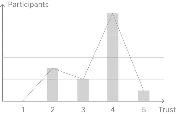
🚨 93% of Users Didn't Fully Trust Google Maps


The average trust in navigation results was 3.5, between 3: Moderately Trustworthy and 4: Very Trustworthy.
→ User trust could be further improved via exploring how information is conveyed, improving trust metrics.
Qualitative Research Process
I used thematic analysis to identify codes and patterns. Given the short timeline of this project, I also drew inspiration from insights gathered via heuristic evaluation, market research and the survey during the affinity mapping process.

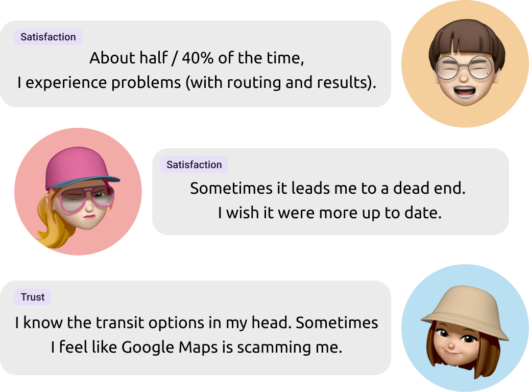
Top Participant Quotes
Participants indicated gaps in satisfaction and trust for routing recommendations.

Key Qualitative Insights
All 5 users chose Google Maps as their top app to navigate via public transit because of familiarity and integrations with places of interest. Although routing is not perceived as the best, it was good enough to accept in exchange for UI conveniences.
🤔 Users Expected Google Maps to Provide Routes They Previously Used

Users trust in Google Maps fell when the routes showed did not align with their expectations gained from previous transit experiences.
→ Align user expectations with their personal preferences and transit history to improve user trust metrics.
🫣 Users Tend To Ignore Subway Service Updates

Subway service updates were mostly ignored because of the lack of relevance and wordy updates.
→ Specify subway updates to user routes to increase usability and understanding.
😵 Users Often Got Confused With Navigating Within Subway Stations

Navigation to and within subway stations tended to be confusing, causing user disappointment and reduced satisfaction.
→ Provide users with more information on subway entrance statuses and transfers to improve user satisfaction.
Prioritization
I mapped the findings onto an Impact x Effort matrix to prioritize product features. I honed into 3 problems and ultimately decided to focus efforts on the problem that aligned most closely with survey insights.
→ How might we personalize results to align route recommendations with user expectations?

Wireframes
For speed of ideation, I explored ideas with low-fidelity wireframes on paper.

Utilize Existing Timeline Feature
Google Maps Timeline is an existing feature that remembers route history. It includes details like transport type (walking, public transit, driving), and places of interest visited.
By utilizing this existing feature, Gemini could parse user's transit history and personalize routing recommendations based on user's transit history.
Adapt Gemini for Routing
Google's Gemini enables users to ask questions on places of interest.
By adapting this feature for routes, users could ask questions about subway stations or service updates to increase user trust and satisfaction.
Prototype
I focused on the following UX laws:
Jakob's Law
Referencing AI overview in Chrome and AI integrations in other Google Apps to utilize existing users' mental models.
Serial Position Effect
Placing access to timeline at top left most position on "You" page to help users notice and remember it.
Common Region
Using lines to define segments of features to help users group related components together.
To align with the look and feel of Google Maps, I referenced Material Design, design patterns in features within Google Maps and within other apps in the Google ecosystem.
User Testing
I conducted 2 user tests.
User Test 1: Identify usability issues in the initial prototype (8 participants)
User Test 2: Validate design decisions in the final product (5 participants)
User Testing 1
I created task scenarios and hosted an unmoderated usability test via Useberry.
To prevent bias from prior participant engagement, 8 new participants were recruited. Participants were encouraged to think aloud while working through test tasks.

User Test 1 Attributes
Metrics
Satisfaction

Trust

Test 1: User Satisfaction and Trust Metrics
Key Insights
🟢 Users Aligned Expectations of Ask Maps With AI Chatbots

Ask Maps aligned with user's mental model of how AI should work - an LLM for asking questions.
→ Keep the general design, but improve trust metrics by providing common prompt shortcuts for first time users to increase understanding.
🔴 Users Didn't Understand Timeline

All users struggled with finding Timeline to grant Gemini access to their transit history. 2 users dropped out of the test and 1 user skipped the Timeline task because they were unable to reach the task completion page.
→ Improve user satisfaction by creating a dedicated Gemini section to increase ease of use.
🔴 All Users Linked AI Access With Settings

Based on user flow and qualitative feedback, users tended to associated transit history with settings. Users tried to enter setting pages to make changes, but were confused when the task required them to access linkage through the Timeline feature.
→ Improve user trust by creating a separate navigation path for users with different mental models for Gemini controls.
Final Product
Ask Maps

Gemini Chat History

Gemini Settings

User Testing 2
5 new users were recruited for testing to validate improvements in user satisfaction.
Route Personalization

Ask Maps

The Route Personalization task saw improvements across the board in the After-Scenario Questionaire (ASQ) and Net Promoter Score (NPS), showing improvements in user satisfaction metrics.
However, despite minimal changes in the Ask Maps task, scores decreased. This was probably due to the comparison between the tasks. In the first user test session, the first task was significantly harder, causing users to rate the second task more favourably in comparison. More testing may be needed to evaluate each task individually.
Retrospective
What Went Well
- Mentorship
I knew I could not tackle this alone without seeking help from others. I am very lucky to have mentors like Kriszta Pozsonyi and Michael Gilbert to guide me in the project and keep me focused on the end goal. Thank you!! ✨
- Unmoderated User Testing
Choosing an unmoderated user test allowed me to collect responses faster as there were no scheduling difficulties. It also allowed me to get their responses without influences from me explaining the task in more detail or providing them hints to achieve the intended user flow.
What Needs Improvement
- Recruit Interview Participants Early
I recruited interview participants only after I had finished consulting mentors and preparing the script. The timeline of the project was delayed because of scheduling difficulties. In the future, I ought to recruit early to secure participants' time.
- Allow Users to Explore
In the user testing sessions, users tended to take time to explore the prototype to orient themselves. This time to explore was counted towards the first task, prolonging the time taken.
In addition, the easier task could have been placed first, enabling users with the confidence to continue.
Thanks for reading to the end! Feel free to explore my other projects.

